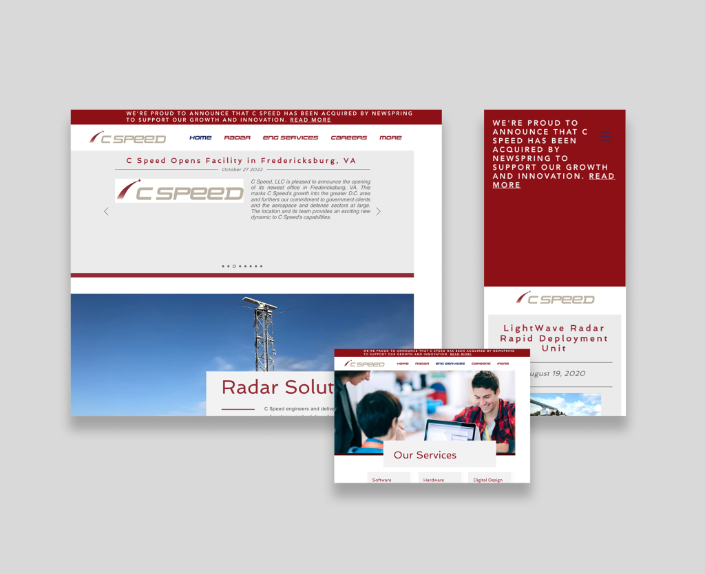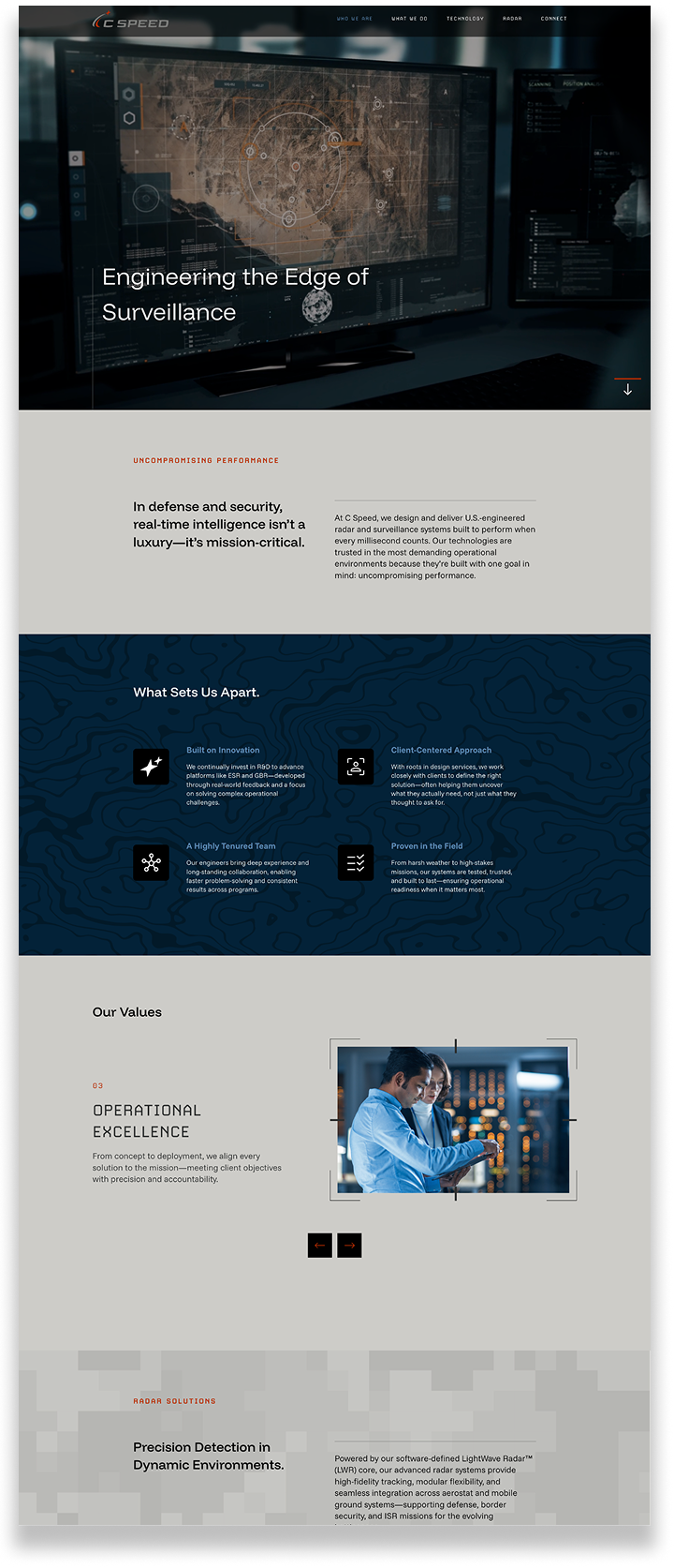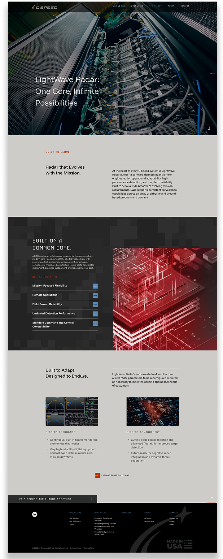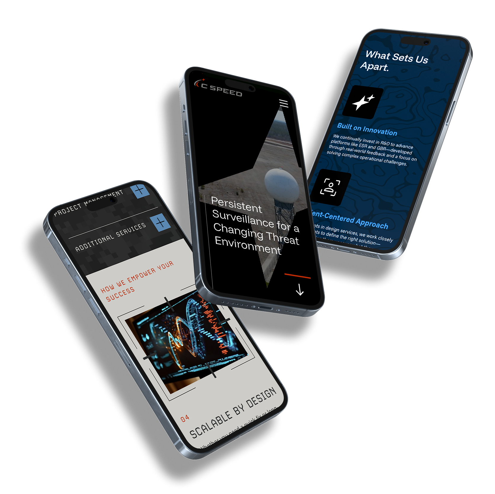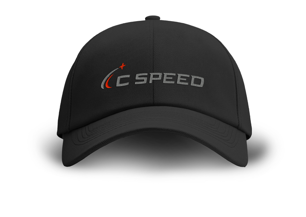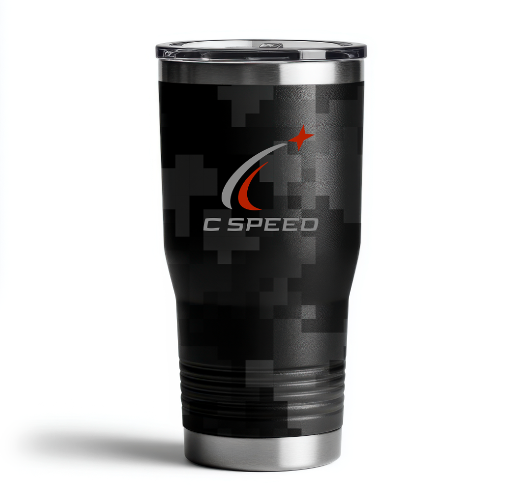
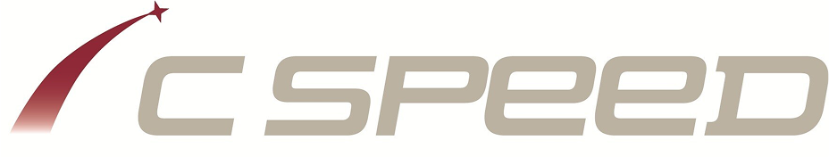

REFRESHED IDENTITY
We modernized the logo to enhance both clarity and precision. The shooting object was enlarged for better legibility at small sizes, and the font refined for a sharper, more contemporary feel. The arced trail lines were reshaped into a deliberate “C,” signaling both speed and tracking accuracy. The black and red palette reinforces intensity, readiness, and mission seriousness.