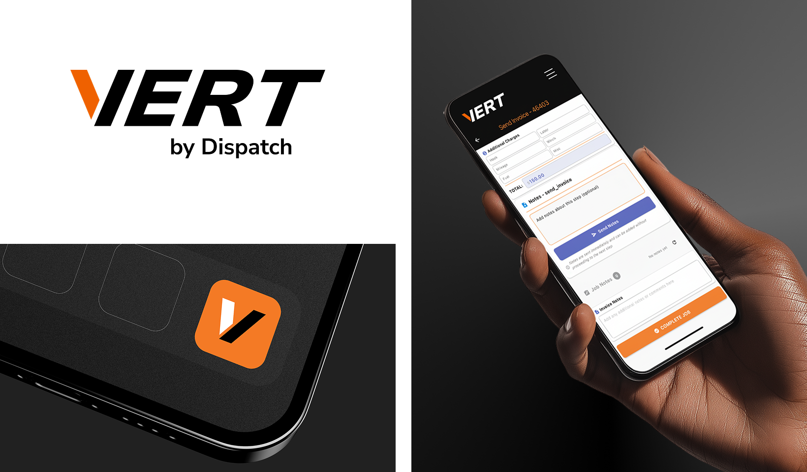
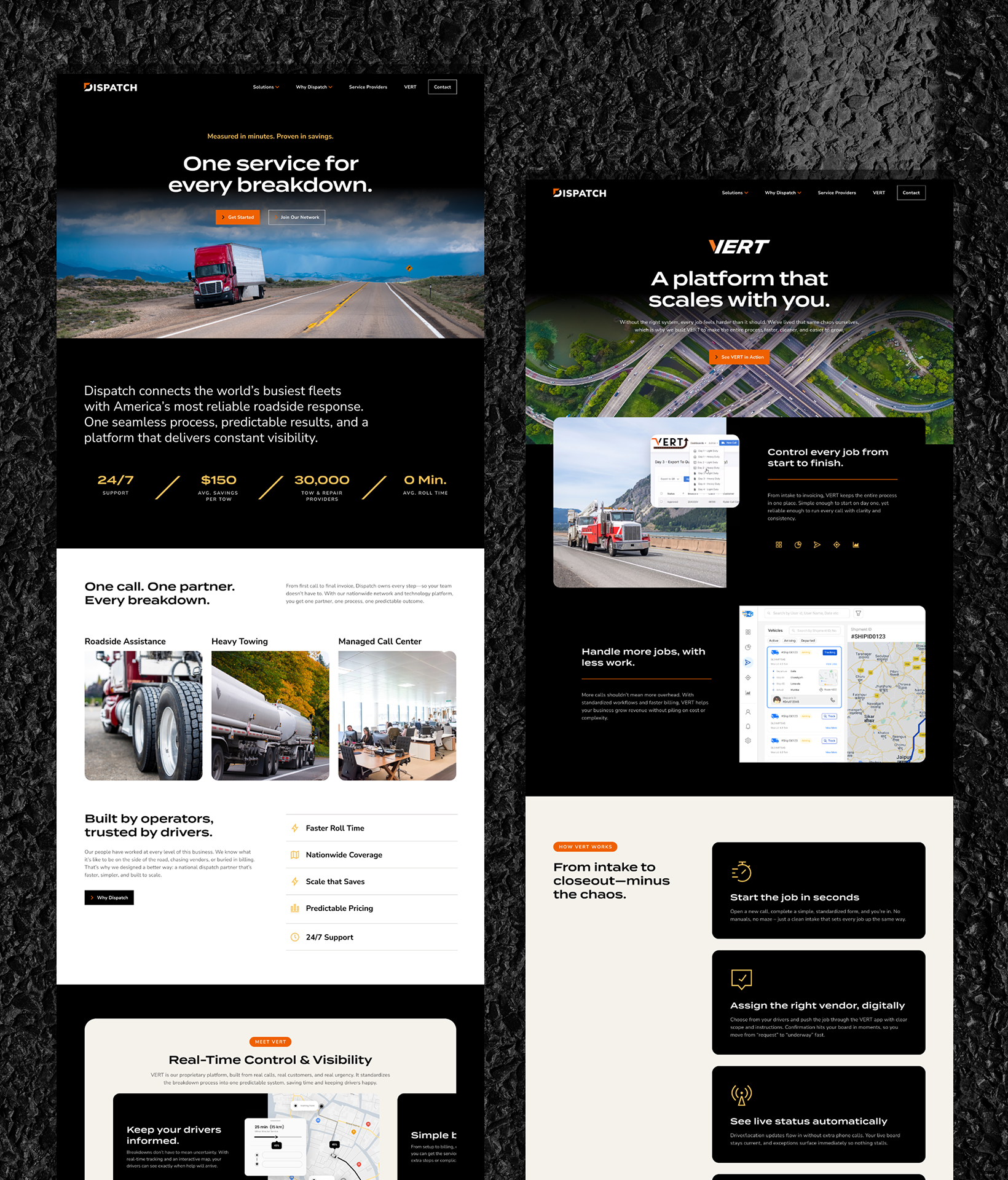
Dispatch

Bringing Clarity to Roadside Chaos

Dispatch built a reputation as the behind-the-scenes partner keeping America’s fleets rolling. But as they expanded nationwide, the brand hadn’t kept pace with its operational strength.

Their story, visuals, and messaging didn’t convey the sophistication or scale of their network, or the measurable value they deliver to fleets and drivers every day. Dispatch needed a brand that reflected its true position: the only nationwide breakdown resolution service built for responsiveness, reliability, and cost efficiency.

The new brand has aligned every part of the organization around a clear promise: faster roll times, cleaner closeouts, and happier drivers. Dispatch now shows up as what it truly is – a best-in-class partner built by operators, trusted by fleets, and designed to scale.

A person sits in the drivers seat of a truck, talking on a phone. The word DISPATCH is overlaid in bold white letters across the image.
An orange mesh-back cap with a black and white geometric logo on the front. Beside it, symbols show the logos construction: a pin shape plus a greater-than sign forming the final logo.

VERT SUB-BRAND

A bold new sub-brand that transforms Dispatch’s proprietary internal software, VERT, into a market-ready platform for towing businesses. The brand architecture ties VERT back to Dispatch, leveraging parent-brand authority to establish trust and signal category leadership from day one.

A collage showing the VERT by Dispatch logo, a VERT app icon on a laptop, and a hand holding a phone displaying the VERT app interface, all with black, white, and orange branding.

WEBSITE

A refreshed, unified digital platform reframes Dispatch for the market, clarifying value for fleet operators, inviting partnership across the towing ecosystem, and positioning VERT as a foundational software capability supporting towing vendors in their business.

A black background with white and orange text lists services using check marks: Rollovers & Recoveries, Winch-Outs, Load Shifts, Accident Recovery, and Breakdowns Beyond Roadside Repair. Termina is shown as the primary typeface.
A website homepage features a trucking logistics service, showcasing images of trucks, a digital dashboard, scheduling maps, service features, customer testimonials, and sections highlighting 24/7 support and real-time control.
A top-down view of seven website mockup screens with a black and orange color scheme, displaying forms, images of people, text blocks, and icons, all laid out on a dark textured surface.

You might Like

#
Portco Industrial Manufacturing Food & Beverage
B-O-F
#
Portco Industrial Manufacturing Food & Beverage
Packline Solutions Group